How to hide/show Toolbar when list is scrolling (part 3)
This is a third (and the really last) post of this series :) If you haven’t read part 1 or part 2 that’s ok because they are deprecated now. In previous parts I showed how to manually achieve hiding/showing Toolbar when list is scrolling. But now we have the Design Support Library and we don’t have to write it on our own! I will show how to use CoordinatorLayout and create a simple Behavior to hide/show Toolbar and FAB when list scrolls up/down. Many of you had a problem with tabs and lists that contain too few items to scroll. I’m happy to tell you that thanks to CoordinatorLayout all these problems are gone :) Let’s begin!
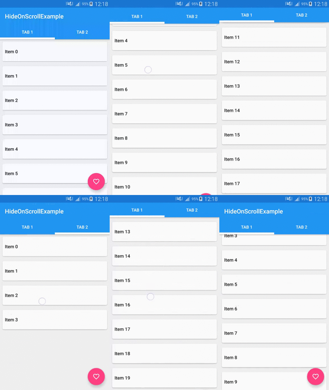
This is what we want to achieve:
Preparation
In order to use the new cool features that Design Support Library has to offer we need to modify our build.gradle file:
It’s just updated SDK, build tools and libraries to the newest version. And as you can see there is also a new one at the end compile 'com.android.support:design:22.2.0'.
Now we can create our PartThreeActivity and fill it with some data. Our demo will have 2 tabs with lists of items on each tab. So we’ll need a ViewPager which will be showing two Fragments. In our case both Fragments will display a list of items, so they will be the same. The only difference is that we will show 20 items on first page and only 5 items on second page. This is because I want to show you that even if list is too short to scroll we will be able to show/hide the Toolbar and FAB. So let’s start from creating a PartThreeFragment class.
Here is it’s layout file:
Nothing special here, just a RecyclerView. Let’s jump to PartThreeFragment code:
It’s an ordinary Fragment so I won’t describe it. The only interesting part is that we can give it a number of items that our list will contain (look at createInstance(int itemsCount) and createItemList() methods). RecyclerAdapter and the layout of a single list item is exactly the same as we created in part 2.
So we have it, now we need to setup our PartThreeActivity. Let’s look at the layout file:
Let’s stop a little bit. There are a few new things in there. First is the CoordinatorLayout. It’s a new layout that let’s you create interactions between Views that you put inside it. As the documentation says it’s a FrameLayout on steroids. It intercepts touch events and let’s you inject your own [Behaviors]. We’ll see an example of this a little bit later. Next new thing is the [AppBarLayout]. It’s an enhanced version of Linearlayout that allows you to specify scrolling interactions. You can for example create a collapsing Toolbar effect or some other things with it. It’s as simple as puttng it into your layout and setting some attributes. But it’s designed to work in pair with CoordinatorLayout so if you use it in some other ViewGroup you will loose it’s functionality. The last new thing that you can see here is the TabLayout which i think is self-explanatory. It’s basically a new material version of tabs for Android. In our case we want to have the Tabs below the Toolbar so we wrap them in an AppBarLayout. The last part of our layout is a ViewPager. Let’s glue it all together using some Java code:
The only interesting fragment of this class is ViewPager and TabLayout initialization which you can see above. PagerAdapter is a simple implementation of FragmentPagerAdapter so I assume that you are familiar with it. In lines 4 and 5 we are adding two pages to our adapter. First page will contain our PartThreeFragment with 20 items and second page will contain the same Fragment but with only 5 items.
We can now compile it and see how it looks like:
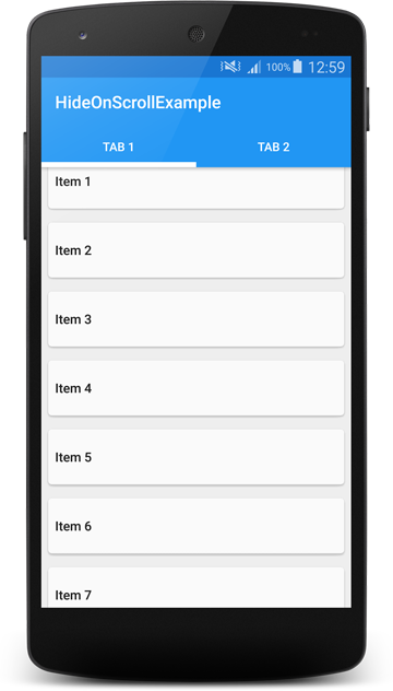
It works but as you can see, the top of the list is not fully visible. It seems that it’s partially covered by our AppBarLayout. To fix this we need to add a Behavior to a ViewPager. It looks like this:
This string value points to android.support.design.widget.AppBarLayout$ScrollingViewBehavior so it’s a fully qualifed Behavior class name. It’s a static inner class inside AppBarLayout class. Behavior is a mechanism that let’s you specify interactions between the Views that you put inside a CoordinatorLayout. The CoordinatorLayout parses Behaviors and handles interactions between Views. Thanks to the fact that you can add it using xml attribute allows adding a Behavior to any View. This is a very powerful API and I really encourage you to play with it. In our case adding ScrollingViewBehavior to the ViewPager causes that it will be positioned correctly according to AppBarLayout and its position will be updated as AppBarLayout scrolls. The new Design Support Library source is not available yet but you can use Android Studio built in decompiler to see what exactly ScrollingViewBehavior is doing.
If we run our app now we should see something like this:
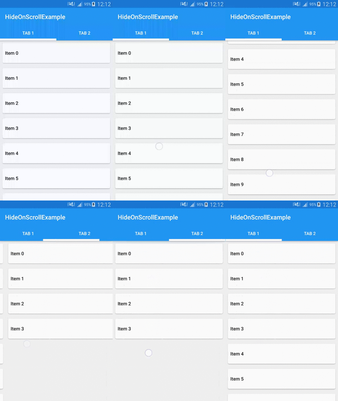
It looks ok, so we can move on.
Scrolling Toolbar and FloatingActionButton
Now it’s time to make our Toolbar scrollable. If you have seen two previous parts of this post you’re probably thinking that we will be creating another OnScrollListener or something. But it’s not the case. Actually we need to add only one line of code to out layout file:
And that’s it! The app:layout_scrollFlags="scroll|enterAlways" line will cause that our Toolbar will scroll of the screen when user scrolls down the list and as soon as he starts scrolling up the Toolbar will show up again. Clean and simple, that’s the power of CoordinatorLayout!
The app now looks like this:
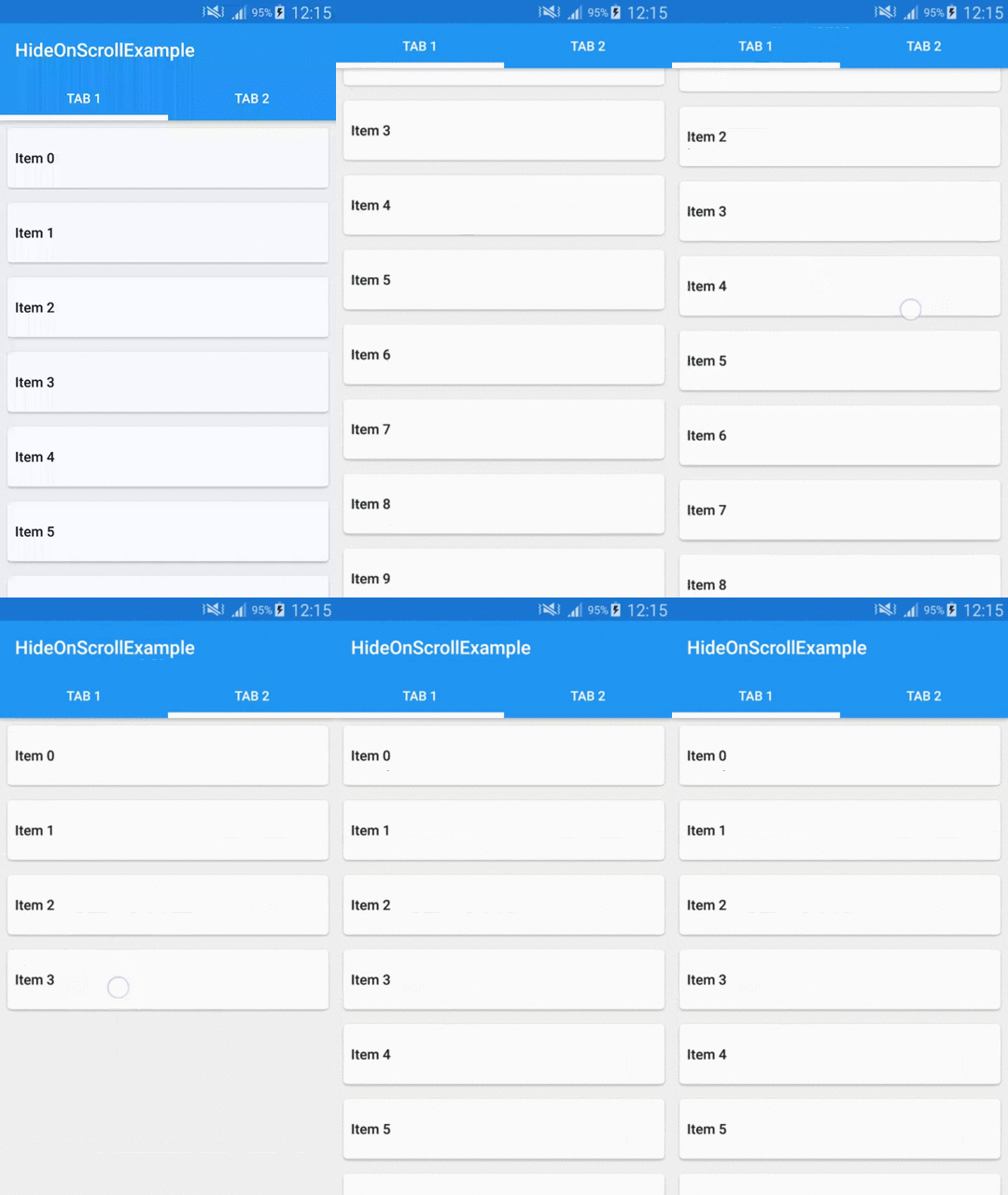
As you can see if you scroll the Toolbar off the screen and change tabs, it remains scrolled off. And even that on the second page we have only 5 items, so list itself cannot be scrolled, you can still show the Toolbar. The CoordinatorLayout makes it possible.
So the last part is adding a FAB. In part 1 we had to create it manually. We were using an ImageButton with a circular drawable as a background. From now on we have a FloatingActionButton widget in the Design Support Library! Let’s add it to our activity_part_three.xml layout file:
There are some known issues with FAB and other widgets from Design Support Library but most of them are already fixed so all we have to do is to wait for the release of the updated version. More on using new FAB widget you can read on Antonio blog. Our app now have a FloatingActionButton:
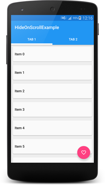
But if we start scrolling, the FAB stays in place and only the Toolbar is moving. To address this issue we will create a custom Behavior for our FAB. Let’s look at the code:
It’s not a lot of code as you can see. Let’s look at the important parts. First we extend from CoordinatorLayout.Behavior class. Note that we have to override constructor taking Context and AttributeSet as parameters in order to use this Behavior in our layout (xml) files. Next method that we need to override is layoutDependsOn. This method tells CoordinatorLayout that we want our FAB to depend on AppBarLayout. So from now on we will be notified about changes of an AppBarLayout size or position. To receive this notification we have to override another method which is onDependentViewChanged. In this method we are calculating how much of the AppBarLayout is scrolled off the screen and we are scrolling our FAB accordingly. So if a half of our AppBarLayout is scrolled off then a half of FAB should also be scrolled off. That’s basically it. Calculating ratio and moving FAB. We return true from this method because it changes position of child view (FAB in our case). What we need to do right now is to add this behavior to our FAB. Let’s do it then:
As you can see we are using fully qualified name of our Behavior class.
Let’s see how it works:

Great, now the FAB moves with our Toolbar!
As you can see the new Design Support Library is really powerful. Using it is pretty simple but it takes some time to get used to new stuff. I again encourage you to play with it and see what else you can do. Behaviors are very flexible and there is a lot more methods available in there. As I have said there are still some rough edges. For example the Toolbar is not snapping to the position, there is some issue with Overscroll which shows when you fling up but not when you scroll up etc. Most of these issues has status FutureRelease so we will get the fixes soon :)
Code
Source code of the full project described in this post is available on GitHub repo.
- Michał Z.
If you liked this post, you can share it with your followers or follow me on Twitter!