How to hide/show Toolbar when list is scrolling (part 2)
This post is outdated, you should jump to part 3 or stay if you are bored :)
This is a second (and the last) post of this series. If you haven’t read part 1 I recommend you to do it. In previous part we’ve learned how to achieve an effect of hiding Toolbar like Google+. Today we will see how we can make it to behave like Google Play Store Toolbar. Let’s begin!
Before we start, I would like to say that I’ve refactored this project a little bit - it’s split in two Activities: PartOneActivity and PartTwoActivity that are started from MainActivity. Code is in the packages partone and parttwo so you can easily find classes that interest you.
This is how our final effect will look compared to Play Store Toolbar:
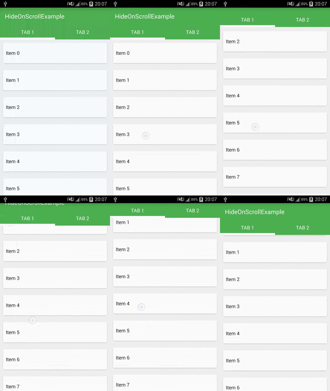

First things first
I won’t show build.gradle file because it’s the same as in part 1 so we will start from creating a layout for our Activity:
It’s just a RecyclerView and a Toolbar (we will add Tabs later). Notice that I’m using the second method (with adding padding to RecyclerView) described in previous post.
I will omit a layout file of our list item because it’s exactly the same as before. RecyclerAdapter was also described so we can skip it (here is how it should look - simple adapter, without header).
Let’s jump to our PartTwoActivity code:
It’s a basic initialization of RecyclerView and Toolbar, notice setting OnScrollListener in line 27.
The most interesting part is HidingScrollListener, so let’s create it!
If you’ve read previous part it should look familiar (actually it’s even simpler right now). What do we have here?
There is only one important variable so far - mToolbarOffset which holds a scrolled offset relative to Toolbar's height. To put it simply, we want to track only values between 0 and Toolbar height so thanks to this:
it will be increased if we scroll up (but we don’t want it to be bigger than Toolbar's height) and decreased if we scroll down (again we don’t want it to be lower than 0). You will see why do we restrict these values soon.
We are also clipping mToolbarOffset because it’s possible that it will have some value out of our range for a small period of time (e.g. during fling) and it would cause flickering.
We’ve also defined onMoved() - an abstract method which we call during scroll.
It may surprise you but this is it for now!
We have to get back to our PartTwoActivity and implement onMoved() method inside our scroll listener:
Yup, that’s all. We can run our app and see what do we have:
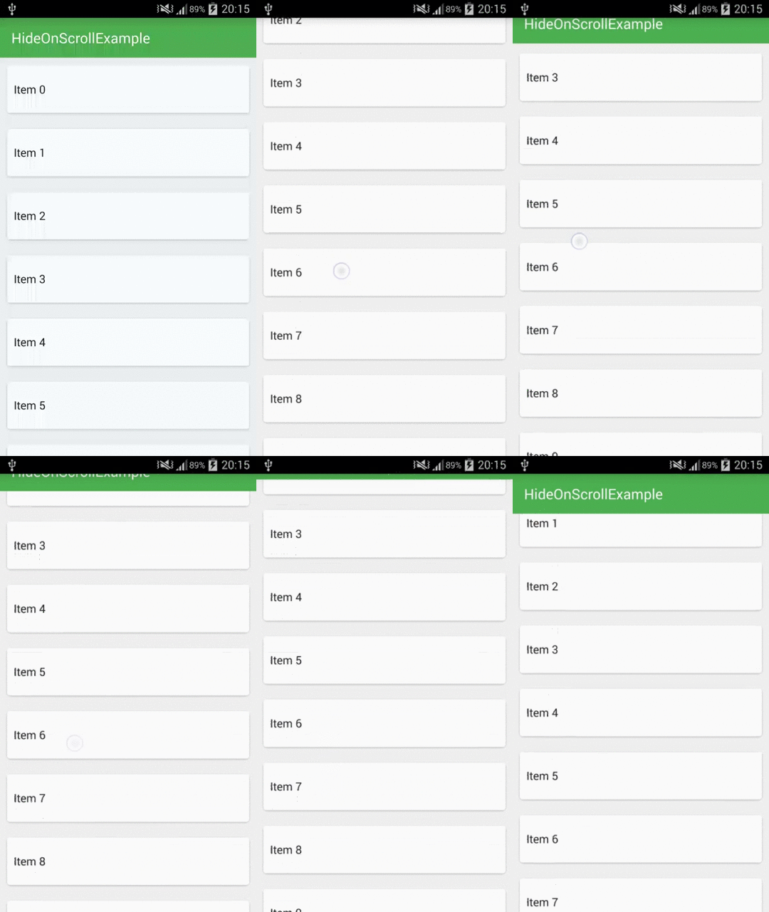
Pretty good, the Toolbar is moving along with the list and getting back just as we expect it to. This is thanks to the restrictions that we put on the mToolbarOffset variable. If we would omit checking if it’s bigger than 0 and lower than mToolbarHeight then when we would scroll up our list, the Toolbar would move along far away off the screen, so to show it back you would have to scroll the list down to 0. Right now it just scrolls up to mToolbarHeight position and not more so it’s “sitting” right above the list all of the time and if we start scrolling down, we can see it immediately showing.
It works pretty well, but this is not what we want. It feels weird that you can stop it in the middle of the scroll and the Toolbar will stay half visible. Actually this is how it’s done in Google Play Games app which I consider as a bug.
Snapping the Toolbar
I think that views should smoothly snap to the position like Logo/SearchBar in Chrome app or Toolbar in Play Store app. I’m pretty sure that I saw it somewhere in Material guidelines/checklist or heard in one of Google I/O presentations.
Let’s revisit out HidingScrollListener code:
It got a little bit more complicated but there is nothing scary in there. We’ve just overrided the second method of the RecyclerView.OnScrollListener class which is onScrollStateChanged(). This is what we’re doing in this method:
- We are checking if the list is in
RecyclerView.SCROLL_STATE_IDLEstate so it’s not scrolling nor flinging (because if it is, we’are translating Y position of theToolbarmanually - like before). -
If we lift up our finger and list has stopped (it’s in
RecyclerView.SCROLL_STATE_IDLEstate) we have to check if it’s visible and if it is, then this means that we have to hide it ifmToolbarOffsetis bigger thanHIDE_THRESHOLDor we have to show it again ifmToolbarOffsetis lower thanSHOW_THRESHOLD: - And if it’s not visible then we have to do the opposite - if
mToolbarOffset(which now is calculated from top position so it’smToolbarHeight - mToolbarOffset) is bigger thanSHOW_THRESHOLDthen we are showing it and if it’s lower thanHIDE_THRESHOLDthen we are hiding it again:
onScrolled() stays the same as it was, and we don’t have to change anything else here. The last thing that we need to do is to implement our two new abstract methods in PartTwoActivity class:
It’s time to build our project and see the effect:
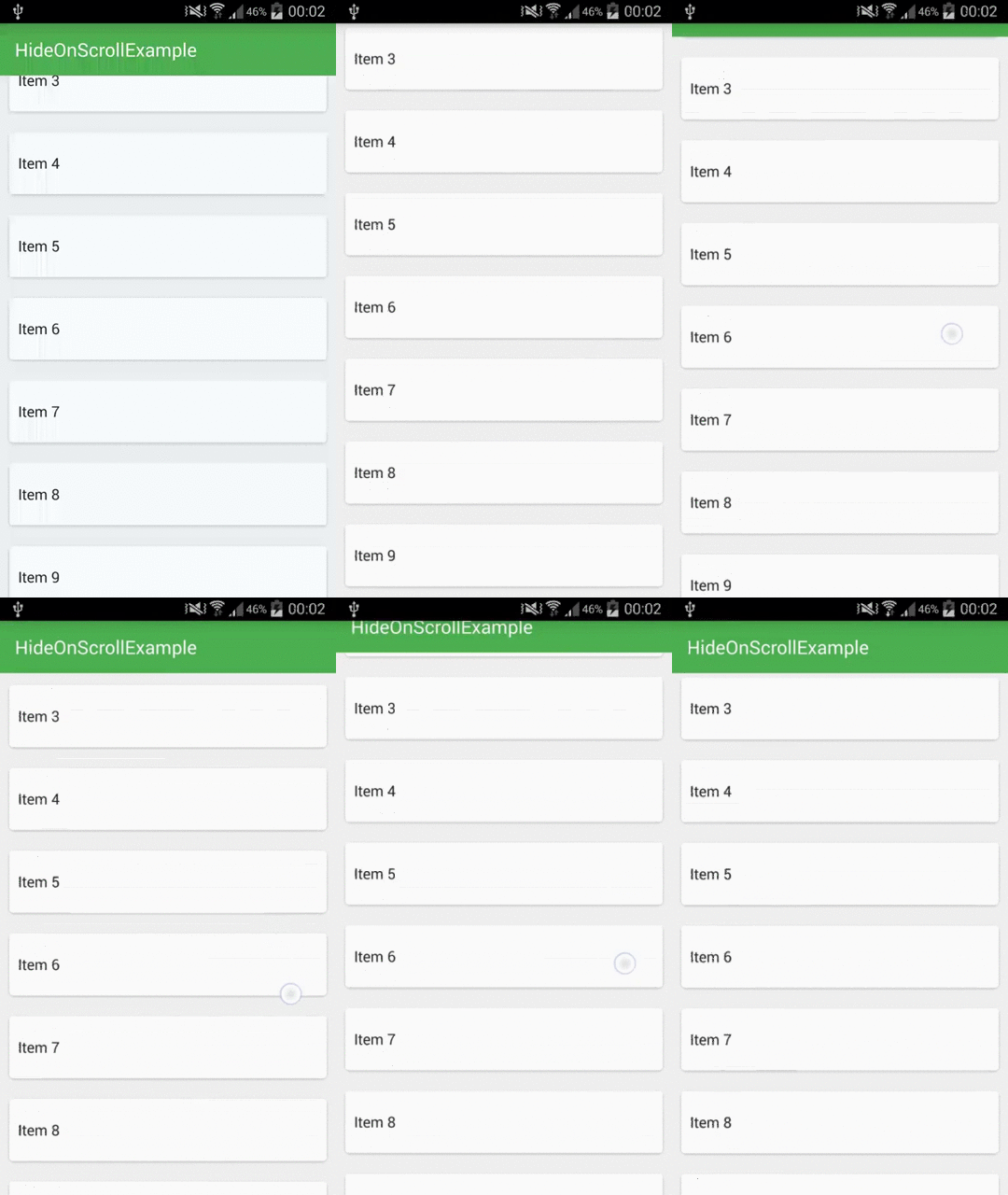
Looks like it’s working! :)
You may think that adding the tabs will complicate the code, so let me show you that it’s not the case.
Adding Tabs
We need to modify our Activity's layout:
and tabs.xml:
As you can see I’m not adding real Tabs, just a layout that mimics their look. It won’t change anything in the implementation. You can put any view here. There are some implementations of the Tabs for Material Design available on github or you can create them yourself :)
Adding the Tabs means that they will cover our list a little, so we need to increase the padding. To make it flexible we won’t be setting this in xml (notice removed padding from RecyclerView in part_two_activity.xml), because Toolbar can have different height depending on orientation or device (e.g on tablets), so we would have to create a bunch of xml to cover all the cases. Instead we will set the padding in code:
It’s pretty simple, we’re setting the padding to be the sum of Toolbar's height and Tabs' height.
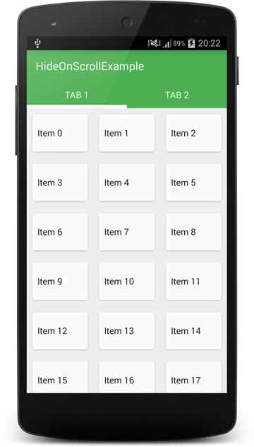
If we run this now we will see something like this:
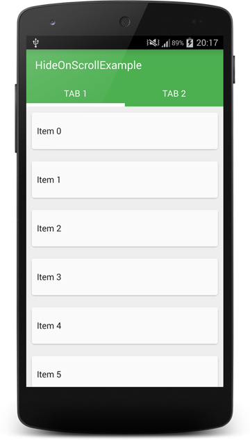
It’s all good, our first list item is perfectly visible, so we can move along. Actually we won’t change anything in our HidingScrollListener class. The only change that needs to be done is in PartTwoActivity:
Can you see what has changed? We are getting mToolbarContainer reference which is a LinearLayout instead of Toolbar, and in onMove(), onHide() and onShow() methods we are translating and animating this view instead of Toolbar. This will move a whole container that contains the Toolbar and Tabs and this is exactly what we need to do.
If we run it we can see that it seems to be working as expected, but if you look closely you will see that there is a little bug in there. Sometimes there is a white line visible between Tabs and Toolbar for the fraction of a second. It’s probably because they are not perfectly synchronized when they are animating. Fortunately it’s not something that we couldn’t fix:)
The fix is very simple, just put the background of the Toolbar and Tabs to their parent layout:
Now even if views are not perfectly synchronized during animation, it won’t be visible.
There is one more bug, the same that we had in part 1. If we are at the top of the list, we can scroll a little bit up and if the HIDE_THRESHOLD small enough, the Toolbar will hide and there will be an empty space(padding) visible above the list. Again - fix is really simple:
We’ve just added one more variable that holds total scroll offset of the list, and when we are about to check if we should show or hide the Toolbar, we first check if we scrolled more than Toolbar's height (if not, we show the Toolbar again).
This is it, let’s run our app!

It’s working very well now :) And it even works with other LayoutManagers without changing anything else:
There was a question in the comment about saving scroll state, and it truly is a problem a little bit. If our item’s text would be long enough to be 2 lines in portrait mode and 1 line in landscape mode then our items heights will be different in portrait and landscape. So if we would scroll to position let’s say 100 in portrait and rotate the device with saving mTotalScrolledDistance and after rotation we would scroll up the list to the top, then mTotalScrolledDistance could be different than 0. There is no simple fix for that but for our usecase it doesn’t matter. And if you really want to do something about it, I would reset mTotalScrolledDistance to 0 and show the Toolbar after rotation.
So this is the end of this series of posts. I’m glad that some of you have learned something from the previous part. Thanks for the kind words :) I will continue writing this blog, but I don’t know what will be in the next posts yet:)
I also want to say that I think that methods described in this and previous post work pretty good but I didn’t test them well enough, so I’m not sure if they are ready to use in production code (see for example the saving state problem described above). The goal of this series was to show that you can achieve effects that looks difficult using only simple methods and standard APIs. I’ve also found out that this method can be used for many other things (e.g. creating sticking tabs with parallax background - like in Google+ profile screen). Happy coding!
Code
Source code of the full project described in this post is available on GitHub repo.
- Michał Z.
If you liked this post, you can share it with your followers or follow me on Twitter!