How to hide/show Toolbar when list is scroling (part 1)
This post is outdated, you should jump to part 3 or stay if you are bored :)
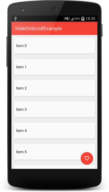
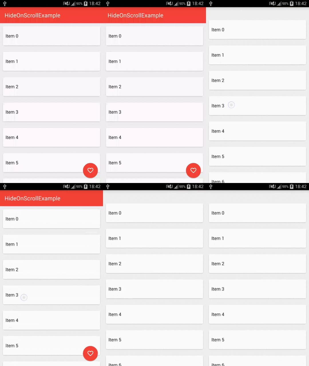
In this post we will see how to achieve an effect that you can observe in Google+ app - hiding Toolbar and FAB (and any other views) when list is scrolling down and showing it again when it’s scrolling up. This behavior is mentioned in Material Design Checklist.
“Where appropriate, upon scrolling down, the app bar can scroll off the screen, leaving more vertical space for content. Upon scrolling back up, the app bar should be shown again.”
This is how our goal should look:

We will be using RecyclerView for our list but it’s possible to implement it in any other scrolling container (with a little more work in some cases i.e. ListView).
There are two ways that come to my mind on how to achieve this:
- With adding a padding to the list.
- With adding a header to the list.
I decided to implement only the second one because I saw multiple questions on how to add a header to RecyclerView and this is a good opportunity to cover this but I will also briefly descripe the first one.
Let’s get started!
We will begin from creating our project and adding necesarry libraries:
Now we should define styles.xml so that our app will use Material Theme but without ActionBar (we will be using Toolbar):
The next thing is to create our Activity layout:
It’s a simple layout with RecyclerView, Toolbar and ImageButton which will be our FAB. We need to put them in a FrameLayout because Toolbar needs to be overlayed on RecyclerView. If we don’t do this, there will be an empty space visible above the list when we hide the Toolbar.
Let’s jump into the code of our MainActivity:
As you can see it’s a relatively small class. It only implements onCreate which does the following things:
- Initializing
Toolbar - Getting a reference to our FAB
- Initializing
RecyclerView
Now we will create an adapter for our RecyclerView. But first, we have to add a layout for our list items:
And corresponding ViewHolder:
Our list will be showing cards with only text so this is it - easy!
Now we can jump to the RecyclerAdapter code:
It’s a basic RecyclerView.Adapter implementation. There is nothing special about it. If you want to find about more about RecyclerView, I recommend you reading Mark Allison’s great series of posts
We got all the pieces in place so let’s run it!

Oh wait.. what is this? The Toolbar hides our list items and as you have probably noticed it’s because we are using FrameLayout in our activity_main.xml. This is the moment when we have two options that I mentioned at te beginning.
First option will be to add a paddingTop to our RecyclerView and set it to Toolbar height. But we have to be careful because RecyclerView will clip it’s chilren to padding by default so we have to turn it off. Our layout would look like this:
And it would do the thing. But as I said, I wanted to show you another way - maybe a little more complicated which involves adding a header to the list.
Adding a header to the RecyclerView:
First we need to modify our Adapter a little:
Here is how it works:
- We need to define types of items that the
Recyclerwill display.RecyclerViewis a very flexible component. Item types are used when you want to have different layout for some of your list items. And this is exactly what we want to do - our first item will be a header view, so it will be different from the rest of items (lines 3-4). - We need to tell the
Recyclerwhich type item it wants to display is (lines 49-54). - We need to modify
onCreateViewHolderandonBindViewHolder()methods to return and bind a normal item if it’s type isTYPE_ITEMand a header item if it’s type isTYPE_HEADER(lines 14-34). - We need to modify
getItemCount()- we return a number of items in our dataset +1 because we have also a header (lines 43-45).
Now let’s create a layout and ViewHolder for the header view.
The layout is very simple. Important thing to notice is that it’s height needs to be equal to our Toolbar height. And it’s ViewHolder is also pretty straightforward:
Ok, it’s done so we can try it out!

Much better, right?
So to sum up, we have added a header to our RecyclerView that has the same height as Toolbar and now our Toolbar hides header view (which is an empty view) and all of our list items are perfectly visible.
And finally we can implement showing/hiding views when list is scrolling.
Showing/hiding views when list is scrolling.
To achieve this we will create only one more class - OnScrollListener for RecyclerView.
As you can see there is only one method where all the magic happens - onScrolled() method.
It’s parameters - dx, dy are the amounts of horizontal and vertical scrolls. Actually they are deltas, so it’s the amount between two events, not total scroll amount.
Basically an algorithm works like this:
-
We are calculating total scroll amount (sum of deltas) but only if views are hidden and we are scrolling up or if views are visible and we are scrolling down because these are the cases that we care about.
-
Now if this total scroll amount exceeds some threshold (that you can adjust - the bigger it is, the more you have to scroll to show/hide views) we are showing/hiding views depending on the direction (dy>0 means that we are scrolling down, dy<0 means that we are scrolling up).
-
We aren’t actually showing/hiding views in our scroll listener class, instead we make it abstract and call show()/hide() methods, so the caller can implement them.
Now we need to add this listener to our RecyclerView:
And here are the methods where we animate our views:
We have to take margins into account when we are hiding views, otherwise fab would’t fully hide.
It’s time to test our app!

It looks almost good. Almost because there is a little bug - if you are at the top of the list and threshold is small, you can hide the Toolbar and have empty space at the top of the list visible. Fortunately there is an easy fix for this. All we need to do is to detect if the first item of the list is visible and trigger our show/hide logic only if it’s not.
After this change if the first item is visible and views are hidder, we are showing them, otherwise it works as before. Let’s run our project again and see if it helped.

Yup! It seems like everything is working like a charm now :)
It was the first blog post in my life so forgive me if it was boring or if I have made some mistakes. I will improve in the future.
And if you don’t want to use the method with adding a header, you can still use the second one with adding padding to the RecyclerView. Just add the padding and use HidingScrollListener that we’ve just created and it will work :)
In the next part I will show you how to make it to behave like scrolling in Google Play Store app.
If you have any questions feel free to ask them in the comments below.
Code
Source code of the full project described in this post is available on GitHub repo.
Thanks to Mirek Stanek for proof reading this post.
- Michał Z.
If you liked this post, you can share it with your followers or follow me on Twitter!